Shifting Nirvana. A Sneak Peek At Mishimoto's New Shift Knob Designs: Pistol Grip
Interested in purchasing one of our new shift knob designs? Check out more product details at the link below!
Mishimoto Shift Knobs
We promised there would be more! Our first design presented Wednesday was pretty slick, and this next design is all about ergonomics and comfort. Not only did the design team work on the aesthetics, but we also spent some time ensuring that the feel of this knob would be ideal for slamming into gears while keeping your eyes pinned to the road.
Initial Design Rendering
As with our other weighted shift knob, this one also started in the 3D world. Check out a couple SolidWorks models showing the initial shape.
Mishimoto pistol grip shifter knob rendering

Mishimoto pistol grip shifter knob rendering
This design is not quite as bold as the last one, but it still certainly makes a statement.

Mishimoto pistol grip shifter knob rendering
3D-Printed Prototype Testing
Testing? What are we testing with a shift knob? We put together a few different grip styles with differences in the finger grooves. We wanted to see how each change affected the feel and which one was preferred for comfort. Check out our lineup of options!

Mishimoto 3D-printed pistol grip shift knob prototypes
We passed these prototypes around the office and listened to the opinions of our co-workers. We have enough folks here to take a good-sized sample, and soon a distinct winner was crowned.

Mishimoto 3D-printed pistol grip shift knob prototype
This one is a slight alteration of the third design you see in the lineup above. The shape of the grooves is identical, but they are placed on a corner rather than on a flat portion of the knob.

Mishimoto 3D-printed pistol grip shift knob prototype
Functional Prototype
Once the design was finalized, we constructed a couple of prototypes to take another look at what we created.

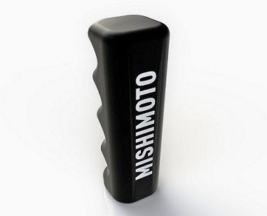
Mishimoto pistol grip shift knob functional prototype
This design is CNC-machined aluminum and weighs in at 204 grams. The additional weight will help with smooth shifting and gear engagement.

Mishimoto pistol grip shifter functional prototype
Suddenly, a hand model showed up as I was snapping some shots. If that hand looks familiar, perhaps you've seen some of his work in the Fall 1973 Bulova Watch catalog.

Mishimoto weighted shift knob functional prototype
This setup works great for either three or four fingers. The weighted shift knob provides some additional inertia, meaning the shift throw is a bit easier. We've had this prototype in the office for a few weeks, and all reports are positive.
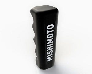
The only minor adjustment to this final design is in logo placement. As you saw earlier in the rendering, we experimented with the script logo on the face of the knob. The functional prototype shown above features our "M" logo on the top. We weren't quite pleased with either choice. Our final selection was the full Mishimoto script in a much smaller font, so it won't detract from the creative design. This knob provides a nice sophisticated appearance with a more traditional shape.
Coming Up
We have one more weighted shift knob design to go! Check back in a few days for another update on our new shift knob collection.
Thanks for reading!
-John